Tuesday, May 10, 2022
Archive
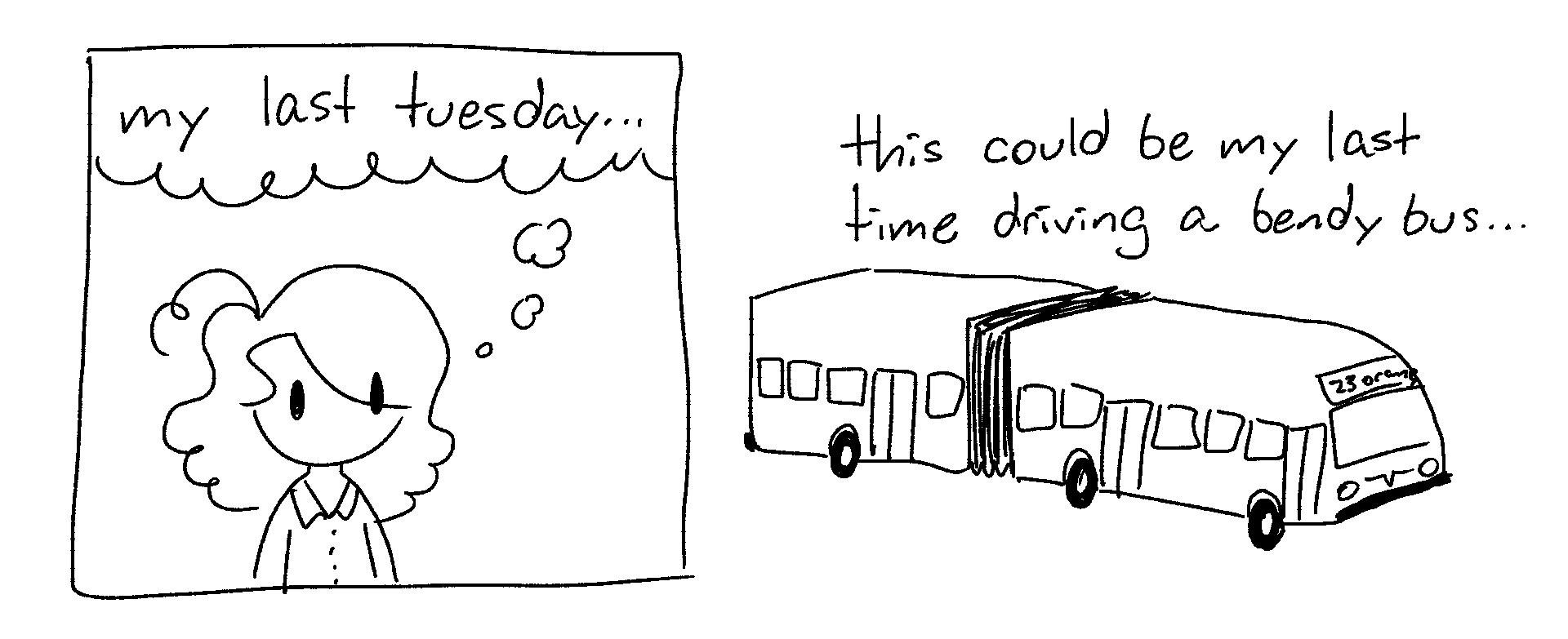
Chart Time
My Tuesday Orange shift does 7 trips, and there's 16 weeks in a semester. There's holes in the data due to either sick days or trainees. (When a trainee drives, I'm not the one counting the passengers.)
My Tuesday Orange shift does 7 trips, and there's 16 weeks in a semester. There's holes in the data due to either sick days or trainees. (When a trainee drives, I'm not the one counting the passengers.)
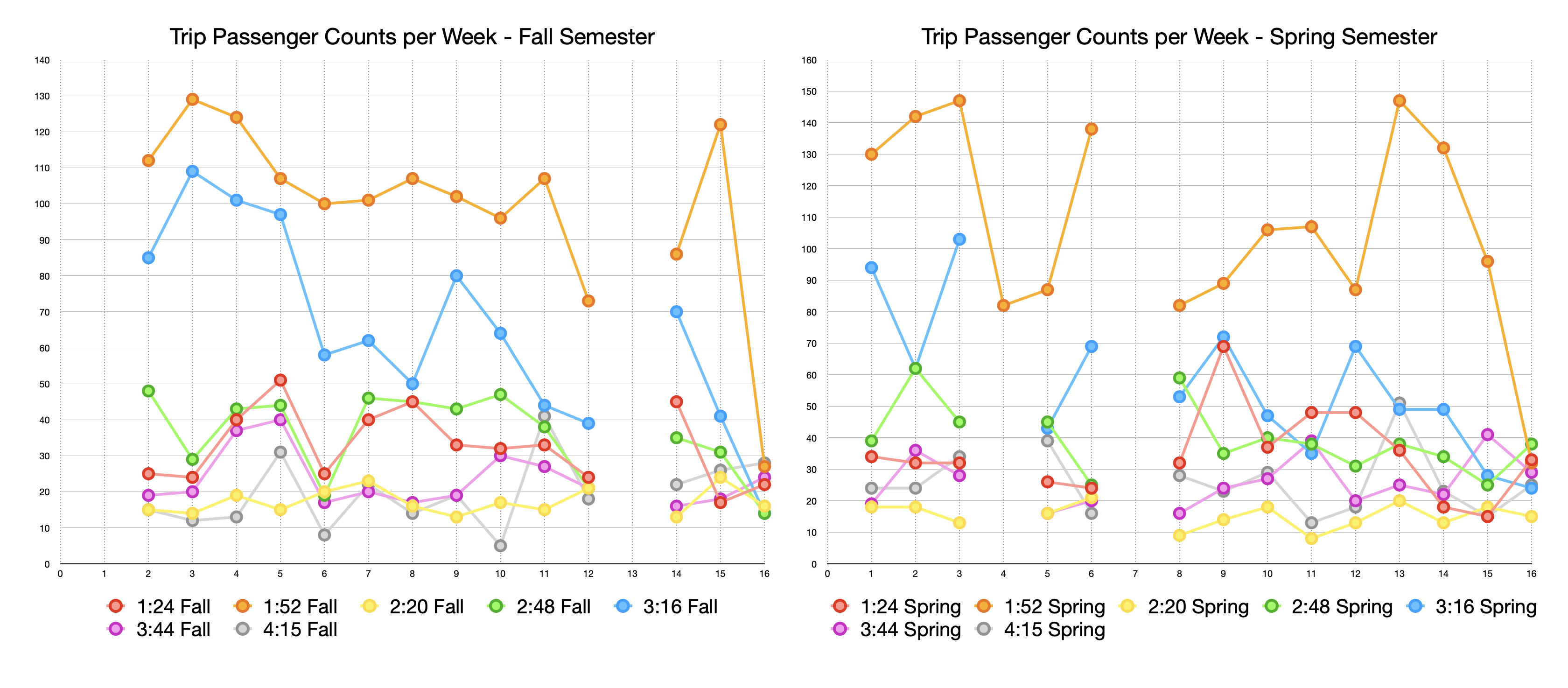
Above is a chart showing how passenger counts changed as the semesters progressed. Each line is a trip, X axis is the week, and the Y axis is the passenger count.
Ridership (on my bus)* seemed down in spring semester-- Fall has two clear "busy" trips, in Spring the second-busiest trip has fallen into the noise. Finals Week clearly has low ridership, and ridership slightly declines as each semester progresses.
* Orange runs every four minutes, so at peak times loads are shared between buses. My passenger counts are not sufficient to determine actual ridership numbers. The difference between fall and spring could be explained by (for example) the bus in front of me running consistently slower (different driver?), and thus picking up more passengers who would have otherwise ridden my bus. This is just for fun, not real data analysis.
Ridership (on my bus)* seemed down in spring semester-- Fall has two clear "busy" trips, in Spring the second-busiest trip has fallen into the noise. Finals Week clearly has low ridership, and ridership slightly declines as each semester progresses.
* Orange runs every four minutes, so at peak times loads are shared between buses. My passenger counts are not sufficient to determine actual ridership numbers. The difference between fall and spring could be explained by (for example) the bus in front of me running consistently slower (different driver?), and thus picking up more passengers who would have otherwise ridden my bus. This is just for fun, not real data analysis.

Here's the same data, graphed as Passenger Count per Trip -- an easier-to-see representation of how it "felt" to drive this shift on average. Each line is one day's shift, the X axis is a trip, and the Y axis is passenger count. Finals weeks is clearly visible as a flat-ish line in both semesters. The 1:52 trip is clearly "the busy one" in both semesters, and again the 3:16 trip is a less pronounced spike in the spring semester.